(This Week) Positioning, Simulations & Sankey Diagrams
22 March 2020
Welcome back to the Week That Was series where I highlight a few things from the interwebs which I thought were interesting, noteworthy and probably worth your time. Articles📝, Tweet(s)📱, Videos🎥, Charts 📈 all fair game with or without attendant commentary.
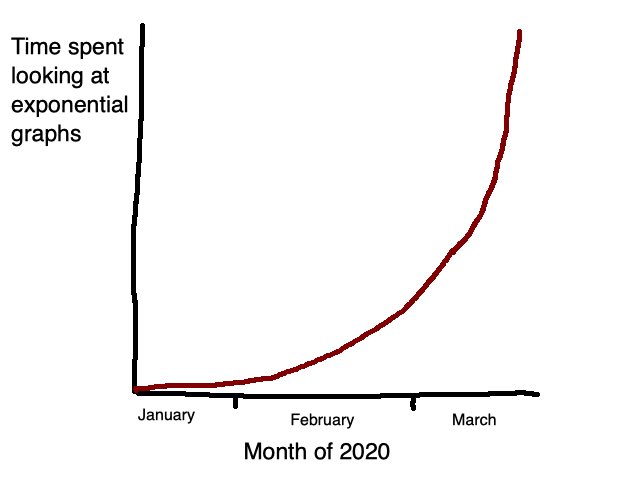
🧐📈 It’s Exponentials All The Way Down
Credit: Original thread…which is often hilarious
🗑️ Inferring Object Position
Although the eyes collect the light - seeing ultimately happens in the brain.
Example of how a stain on the ground leads the brain to make interesting inferences about the position of an object in space.
Credit: @DrGBuckingham
💰💵🤔 Making Sense Of The Money
With many central banks acting aggressively to try counteract the coronavirus-tinged economic shocks, we’ve also seen quantitative easing in the billions of dollars in some places; and trillions elsewhere.
The numbers get large enough to start escaping true comprehension - literally astronomical. Here’s a tweet using seconds to contextualise what a trillion actually represents
(Twitter link blocked)
Of course the US this week approved a rescue package to the tune of $6 Trillion, between the fiscal ($2Trn) and monetary ($4tTrn) actions. In this podcast Planet Money ask the simple question - “Where does the money come from?”
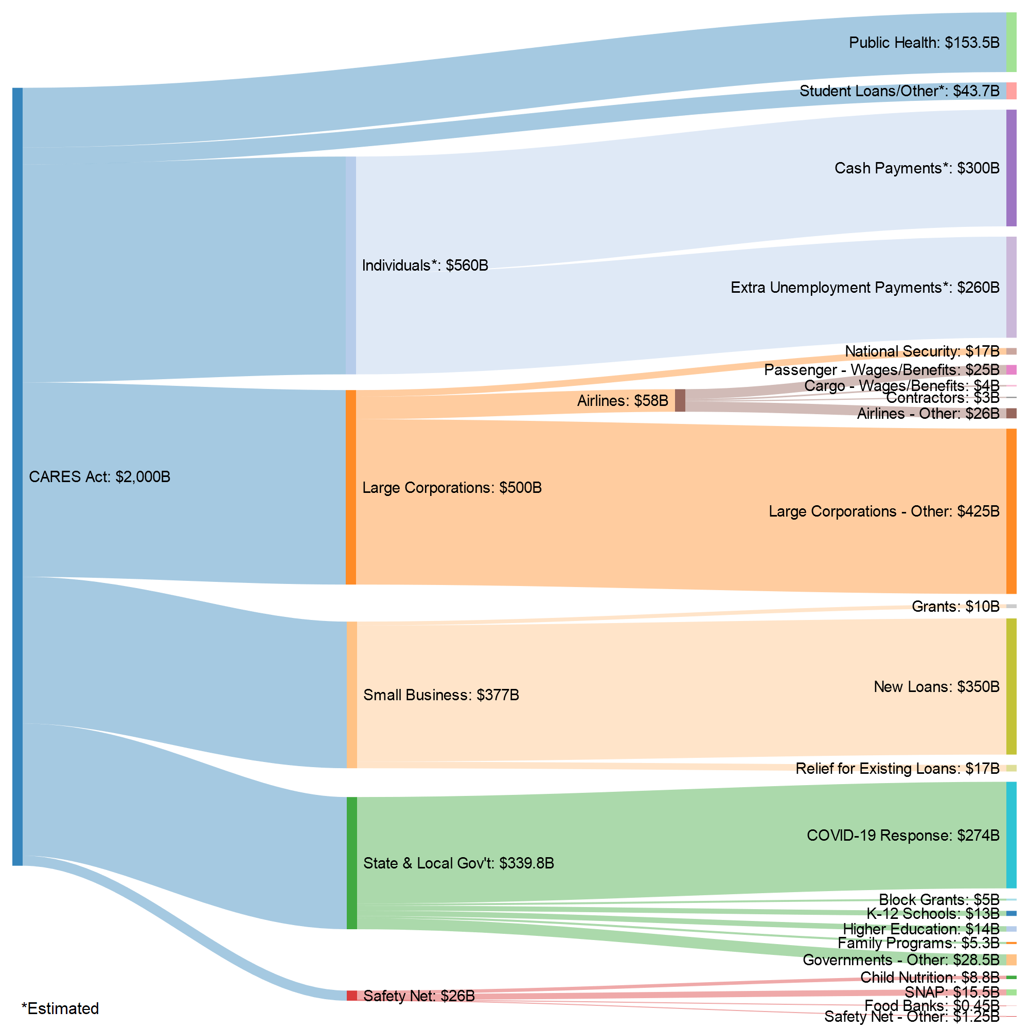
Where Do We Get $2,000,000,000,000?
Sankey Diagram showing the breakdown of how said $2Trn is being allocated
🦠🧼🖐💦⚕ Greenzone
South Africa Update
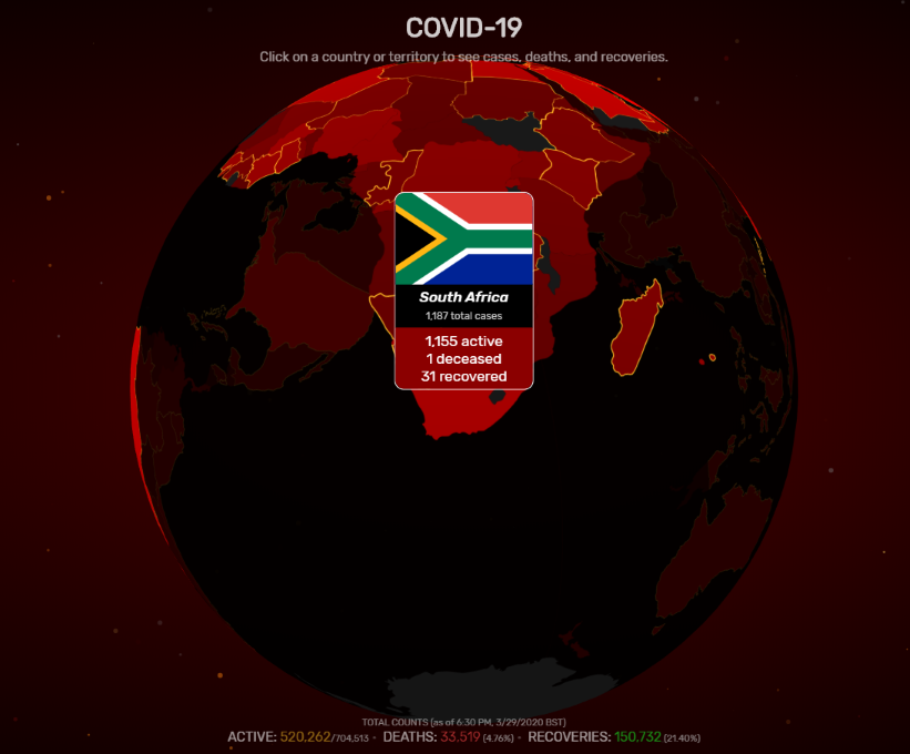
Source: https://www.covidvisualizer.com/
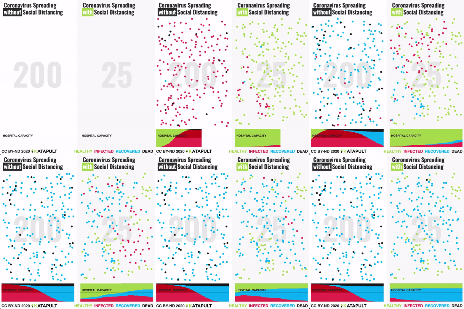
We’ve encountered Youtube channel 3Blue1Brown on these pages before, with his wistful paean to a beautiful equation. Grant returns, doing a cracking job of simulating how various public actions around social distancing affect viral spread.
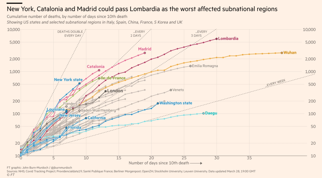
Some numbers from the most recent Financial Times dashboard which is now freely available (hopefully for the duration of the worst parts of this nascent global epidemic).
Italy, Spain & the USA well and truly are now the global epicentres.
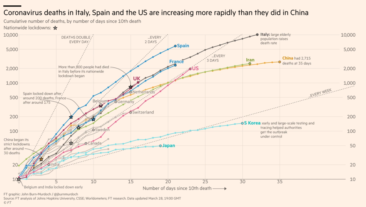
The pattern in the dramatic increase in numbers always tends to follow the pattern… case, case, case….. cluster, cluster, cluster…. explosion. Here are the current sub-national regional case trajectories.
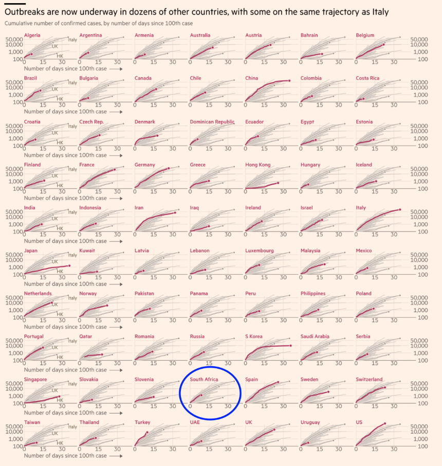
South Africa appears to be the South & Central epicentre on the continent and although it has now instituted a national lockdown, the scale of non-compliance is extremely concerning given the current growth trajectory.
Here’s a quick reminder of the table stakes here.
The Good Judgement Project are a set of forecasters, or more specifically superforcasters, who Philip E. Tetlock assembled and wrote about in his book of the same name. In competitions he’s run, Good Judgement superforecasters have beaten out even CIA agents.
The group is maintaining a page of public predictions for total global cases & deaths attributable to Covid-19 by 2021 and the results are beyong sobering. The site is updated every day so as the information available changes so do the probabilities.
Cases - 2021 (as of 29 March 2020)

Deaths - 2021 (as of 29 March 2020)

Disconcerting. What remains clear is that we need to be taking this seriously while avoiding both panic and being misinformation vectors. It’s also why we need to maintain our end of the social compact and keep our distance. It works.
Silicon Valley VC Balaji Srinivasan, someone I’ve got tremendous respect for and whose insights I appreciate, has been sounding like Chicken Little since late January - pitching up to US conferences in gloves and surgical mask at that time already.
He’s been calling out journalists and others early on who were pushing the “tis but a flu” narrative and has been seeding extremely timely and accurate information into the twitter-sphere for months now.
Here he is reiterating the message that there are demonstrably viable ways to mitigate the spread and damage of this virus - all published and publicly available from Asia.
Here’s what China did. Everything from separate hospitals for COVID19, to constant testing of many types, to WeChat apps to give info for the citizenry, and so on.
— Balaji (@balajis) March 22, 2020
I have other threads on what Korea, Taiwan, SG, etc did.https://t.co/aJ8ArvBPvp
For the last few weeks been looking at the exponential nature of early infection rates and how best to understand/visualise the numbers to make sense of them. What hasn’t been very easy to see visually and thus communicate is how well medical & government interventions are actually working.
With each region’s spread following an exponetial curve, seeing when a region’s case growth leaves this curve and starts descending is a very simple way to roughly approximate whether things are getting better or worse epidemiologically speaking.
Minutephysics and Aatish Bhatia do a fantastic job of modeling exactly this. Log scale on both axes (🤯😏).
💬 Stay Close
“Hope is patience with the lamp lit” — Tertullian
“The cost of a thing is the amount of … life which is required to be exchanged for it, immediately or in the long run.” — Henry David Thoreau
⚙️ Oh…and one more thing
Fractal Gears

Thanks for reading. Tune in next week. Stay Home. Wash Your Hands
Links The Week That Was Pickings
fa17eab @ 2023-09-18
